YUGO SAKE | BRAND IDENTITY & LABEL DESIGN
Yūgō Sake was born on South Australia’s south coast, where the creative energy of the beach meets a deep respect for Japanese tradition. Founded by two women in their twenties, the brand blends original sake brewing practices with the bold, coastal spirit of the Fleurieu Peninsula. The brewery reflects this fusion with its vibrant, unconventional, and proudly rule-breaking feel. Using premium local ingredients, Yūgō Sake brings a fresh take on sake to South Australia, a product originally rooted in tradition, yet now unapologetically modern. Every bottle captures the essence of cultural crossover, where old-world tradition meets new-world inspiration.
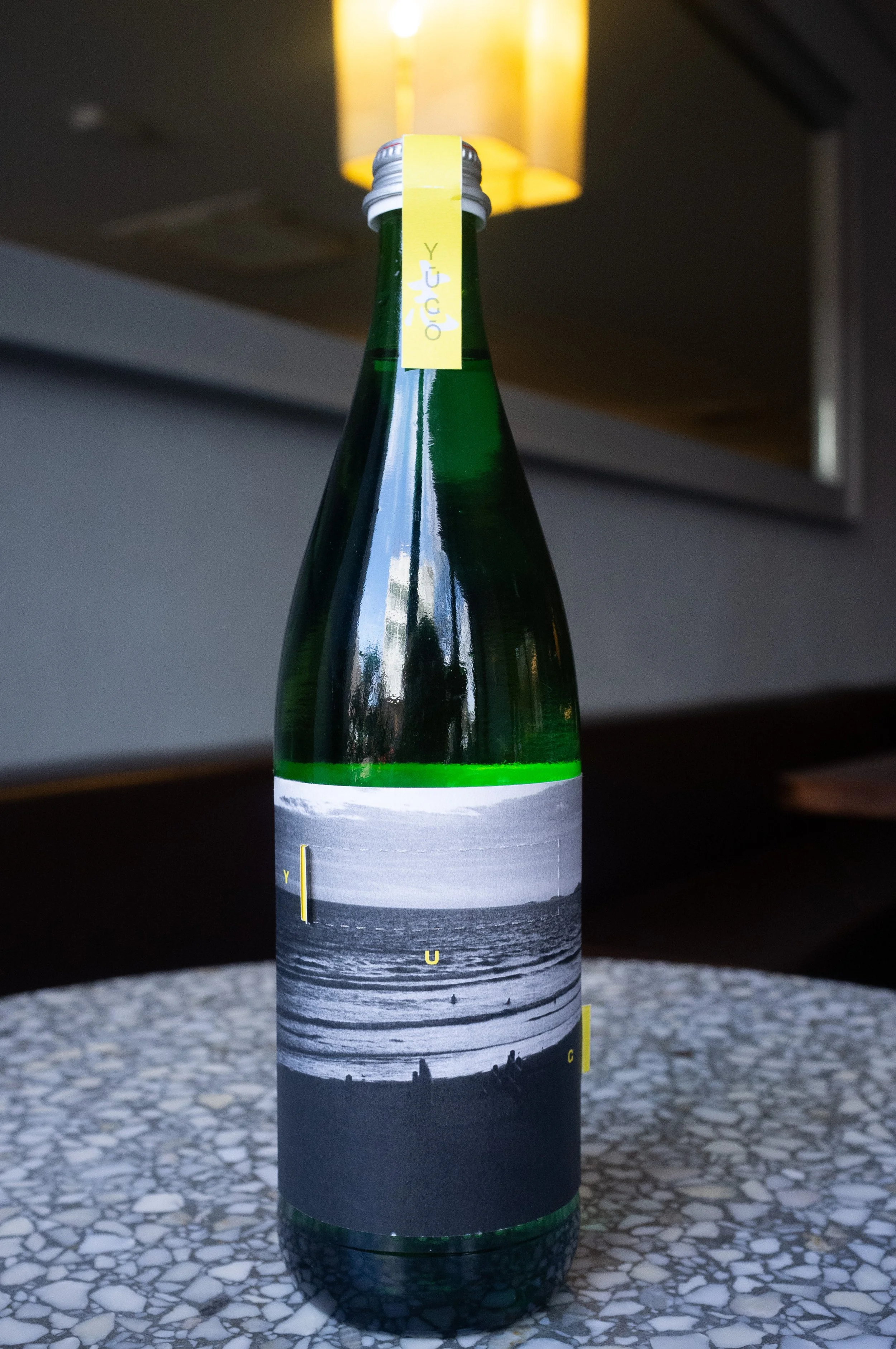
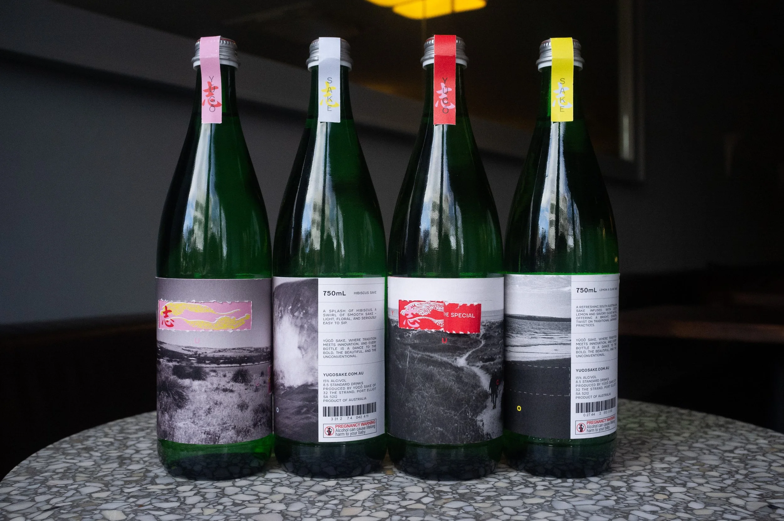
Yūgō Sake’s visual identity was built around the concept of cultural fusion, with the bottle label acting as the primary medium to communicate this narrative. The challenge was to create a design that captured both the refined elegance of traditional Japanese sake and the bold, youthful energy of South Australia’s creative coast.
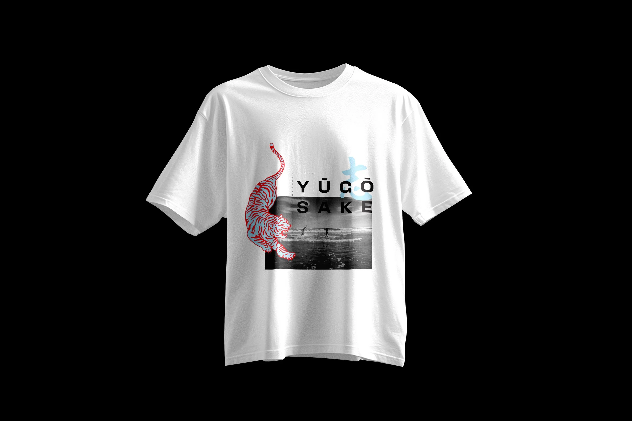
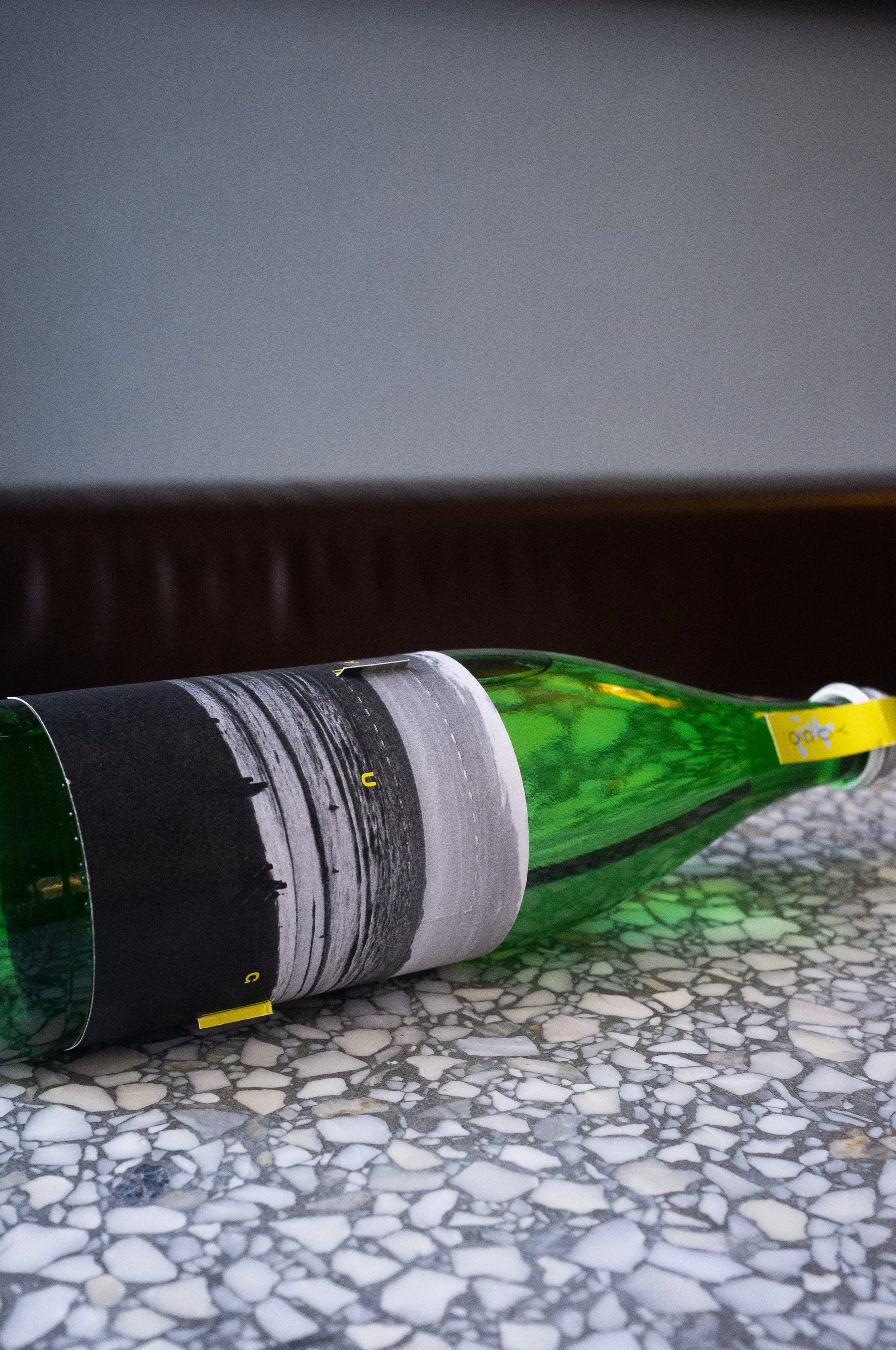
The core design feature is the “tear-away” label system. This concept was developed to represent the idea of uncovering the Japanese tradition as the soul inspiration of the brand. The front label uses a peel-back mechanism, allowing part of the outer layer to be torn away to reveal a hidden layer underneath. This not only creates physical interaction with the product but also leaves a lasting brand impression which has been injected into further promotional design. Both layers contrast one other, the under being a vibrant and expressive Japanese design, the outer displaying calm South Australian landscapes. This visually mirrors the blend of Japanese tradition with the South Australian coastal land. The shape of the “tear-away” labels also reflect the accents above the “U” and “O” in Yūgō, resulting in two parallel rectangles. This motif appears regularly throughout many other components of the brand identity, strengthening the overall brand and expressing the key values and ideas of Yūgō Sake.
To capture the rustic charm of South Australia's Fleurieu Peninsula, Yūgō Sake’s gift packaging was crafted from raw plywood which offers a tactile, earthy alternative to conventional beverage boxes. This material choice not only grounds the product in its coastal origins but also adds a distinct point of difference. Subtle references to Japanese tradition are woven throughout the design, including minimalist logo tags and fine white twine, echoing the elegance of Japanese craftsmanship. Inside, the inclusion of a traditional handmade Tokkuri bottle and two ceramic serving cups further reinforces the cultural connection. Overall, each design component of Yūgō Sake collaboratively visualizes the brand story, one which is unique and like no other.
CASE STUDY | RESPONDING TO BRIEF BY UNIVERSITY